Module 4: Visual Design
Overview
This module introduces the essential principles of visual design, focusing on color theory, typography, and fundamental design principles to help create visually appealing and functional user interfaces.
Ready? Let's commence.
Lesson 1: Principles of Design
Definition: Design principles are guidelines that help create balanced, effective, and visually appealing designs.

Central Tenets of Design: 1.Equilibrium
2.Antithesis
3.Stress
4.Proposal
5.Rank
6.Arrangement
7.Repetition
8.Blank SpaceKey Principles of Design
Balance:
Symmetrical Balance: Equal distribution of elements around a central axis, creating a mirror image.
Example: A website with a centered logo and evenly spaced navigation links on either side.
Asymmetrical Balance: Uneven distribution of elements, yet achieving harmony through contrast and scale.
Example: A webpage with a large image on one side and smaller blocks of text on the other.
Radial Balance: Elements arranged around a central point, radiating outward equally.
Example: A circular infographic with data points evenly spaced around the center.
Key Principles of Design
Contrast:

Utilizing opposing elements (color, shape, size) to highlight differences and create visual interest.
Example: Using a bright color for call-to-action buttons on a muted background to make them stand out.
Emphasis:
Drawing attention to important elements through size, color, or position, creating focal points in the design.
Example: Highlighting a promotion banner with a large font and bold colors on an e-commerce site
Key Principles of Design
Proportion:
The relationship between the sizes of different elements, ensuring they fit well together.
Example: Ensuring text sizes scale appropriately from headings to body text to create a hierarchy.
Hierarchy
Arranging elements to indicate their order of importance, guiding the user’s eye through the design.
Example: Using larger and bolder fonts for headlines, medium fonts for subheadings, and smaller fonts for body text..
Key Principles of Design
Alignment:

Ensuring elements are visually connected and organized, creating a clean and structured look.
Example: Aligning text and images along a common margin to create a neat and organized layout.
Repetition
Repeating elements to create consistency and coherence in the design.
Example: Using the same button style and color scheme across different pages of a website.
White Space (Negative Space)
Using empty space strategically to enhance readability and focus on important elements.
Lesson 2: Color Theory
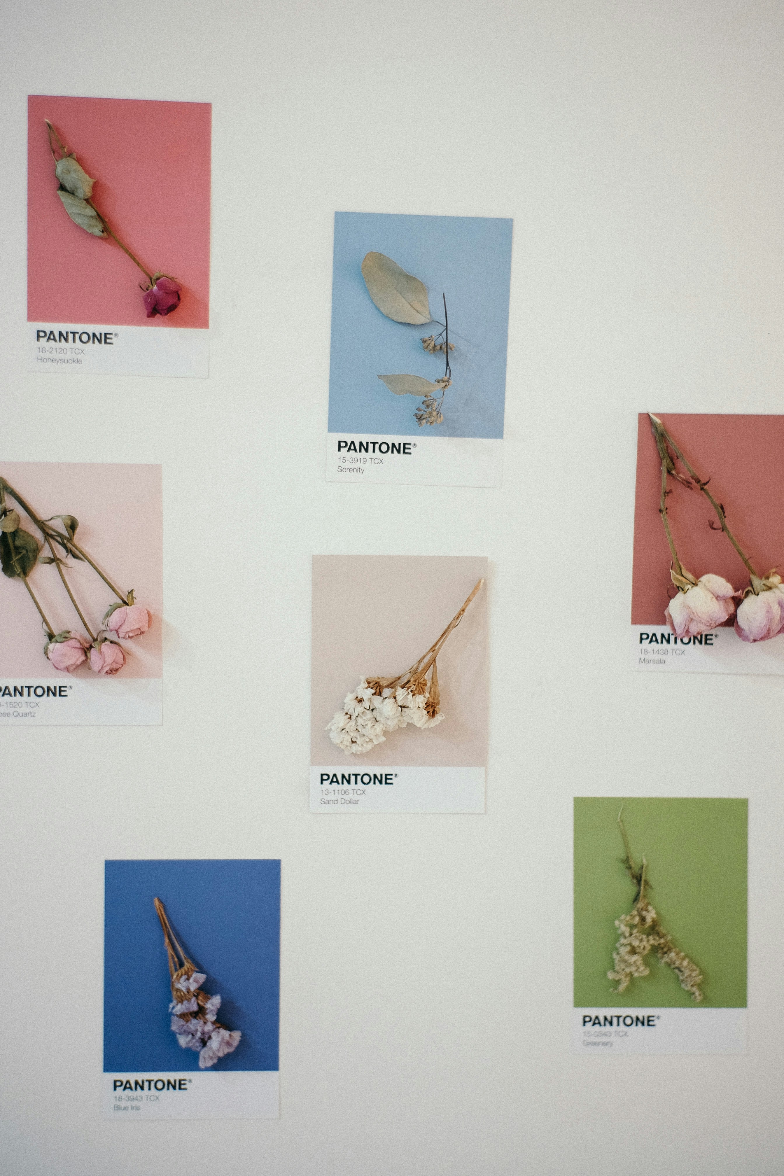
Definition: Color theory is the study of how colors interact, their combinations, and their psychological effects on users.
Key Aspects of Color Theory
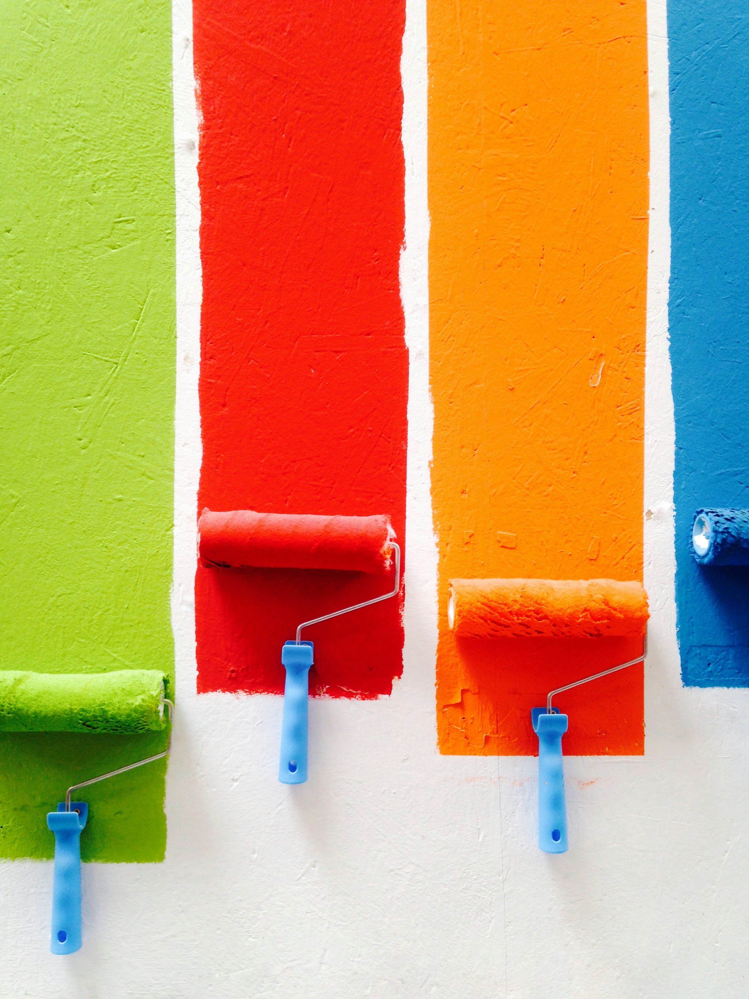
Color Wheel
Primary Colors: Red, blue, yellow.
Example: These colors can’t be created by mixing other colors.
Secondary Colors: Green, orange, purple (created by mixing primary colors).
Example: Blue and yellow make green.
Tertiary Colors: Mixing primary and secondary colors.
Example: Blue-green, red-orange.
Key Aspects of Color Theory
Color Harmony:

Complementary: Opposite colors on the color wheel (e.g., red and green).
Example: Using red and green together for high contrast and vibrancy.
Analogous: Colors next to each other on the color wheel (e.g., blue, blue-green, green).
Example: Creating a serene and harmonious look with shades of blue and green.
Triadic: Three evenly spaced colors on the color wheel (e.g., red, yellow, blue).
Example: Balanced and vibrant color scheme with three distinct colors.
Key Aspects of Color Theory
Color Temperature

Warm Colors: Reds, oranges, yellows (evoke warmth and energy).
Example: Using warm colors to create a welcoming and energetic environment.
Cool Colors: Blues, greens, purples (evoke calm and serenity).
Example: Using cool colors to create a calm and relaxing design.
Psychology of Color
Understanding how different colors affect emotions and behaviors (e.g., blue for trust, red for urgency).
Example: Using blue in a financial app to convey trust and reliability.
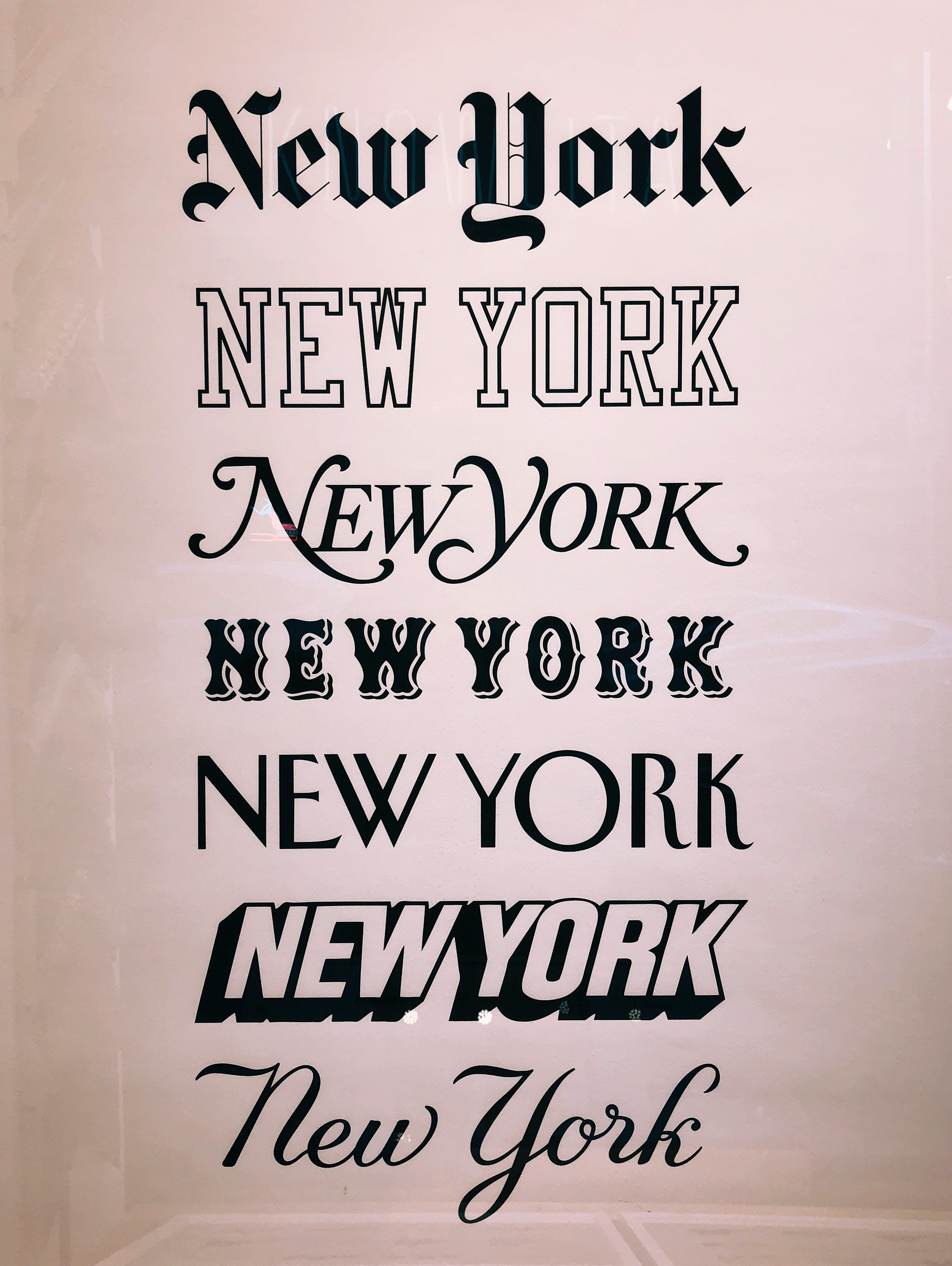
Lesson 3: Typography
Definition: Typography is the art and technique of arranging type to make written language legible, readable, and appealing.

Key Aspects of Typography
1. Font Size and HierarchyEstablishing a clear hierarchy with different font sizes for headings, subheadings, and body text.
Example: H1 for main headings, H2 for subheadings, and paragraph text for body content.
Line Height (Leading)
The vertical spacing between lines of text, impacting readability and visual appeal.
Example: Adequate line height improves readability and prevents text from feeling cramped.
Key Aspects of Typography
Font Types
Serif: Fonts with small lines or strokes at the end of characters (e.g., Times New Roman).
Example: Used in print materials for a traditional and formal look.
Sans-serif: Fonts without the small lines or strokes (e.g., Arial).
Example: Commonly used in digital interfaces for a clean and modern look.
Script: Fonts that mimic handwriting (e.g., Brush Script).
Example: Used for elegant invitations and decorative purposes.
Display: Decorative fonts used for headlines and attention-grabbing text.
Example: .This font is used for attention-grabbing logos and headlines.
Key Aspects of Typography
Letter Spacing (Tracking)
The overall spacing between letters in a block of text, affecting readability and aesthetics.
Example: Increased letter spacing can enhance readability in uppercase text.
Alignment
Left, right, centered, or justified alignment to enhance readability and create visual order.
Example: Left-aligned text is commonly used for readability, while centered text can be used for emphasis in titles.
Practical Application: Design Project
Product to Work On: Blog Website
Design Principles:
Example: Design a blog post template with a balanced layout, clear hierarchy, and proper use of white space.
Color Theory:
Example: Develop a color scheme using complementary colors for call-to-action buttons and analogous colors for background and text.
Typography:
Example: Choose serif fonts for headings to convey a traditional feel and sans-serif fonts for body text for readability.
Submit task
Resources for Further Reading.